Recreating the unexpected interactions of live music — UX Case Study
Designing a safe and natural way for music fans to meet, inspired by the unpredictability of music venues and festivals

The Project
Duration: 13 days
Methods: Stakeholder Interview, User Interviews, Survey, Affinity Diagram, How Might We Notes, Ideation Workshop, Secondary Research, Feature Prioritisation, Wireframing, Prototyping, UI Design
Tools: Figma
Intro
The COVID-19 Pandemic was an arrow to the knee of the live entertainment industry. With venues closing down, artists unable to tour and a situation that didn’t seem like it was going to let up anytime soon, a whole ecosystem was starting to crumble.
Worldwide lockdowns also changed the way people interacted and consumed entertainment. Twitch saw an incredible boom not only in active viewership but also content creators coming to the platform. Musicians turned to Instagram Live to keep playing to an audience and push the albums that they were releasing at an unprosperous time for promotion.
The Challenge
Though online streaming has never been as popular, content creators and viewers share a common pain point:
Livestreaming, as it is today, is neither interactive nor emotional.
V-Cult, a b2b Virtual Reality and Web XR agency, noticed this and presented me with three main paint points and a challenge.
Communication during live streams is almost exclusively top-down:
- For consumers, there is a lack of privacy and security especially for younger users who find themselves alone in a large and often anonymous online crowd.
- For streamers, there is a glaring lack of feedback. They interact with an audience, not individuals, unlike at concerts where they can capture a person's attention in the crowd.
- Interactions between viewers are limited due to the anonymity of online personas. Streaming thus becomes somewhat of a solitary experience, users lose individuality when logging on to view a large-scale stream. There is user feedback but they are waves of reactions that will remain fairly normalized. Everything is collective.
With this in mind, V-Cult asked me to solve a UX issue they were encountering with a core feature that allowed groups of users to communicate, organise and participate in streams together.
Empathise
I needed to understand how users communicate and organise amongst themselves in regard to music events, may they be IRL or IVL.
User Interviews
I was able to interview a wide variety of users such as active fans of certain artists on social media, people working in live music or Twitch streamers. The interviews focused mainly on interviewees’ opinions of online concert experiences, asking them to describe an ideal evening when concerts come back to venues or asking them to tell me stories about the most memorable moments they had at gigs or festivals.
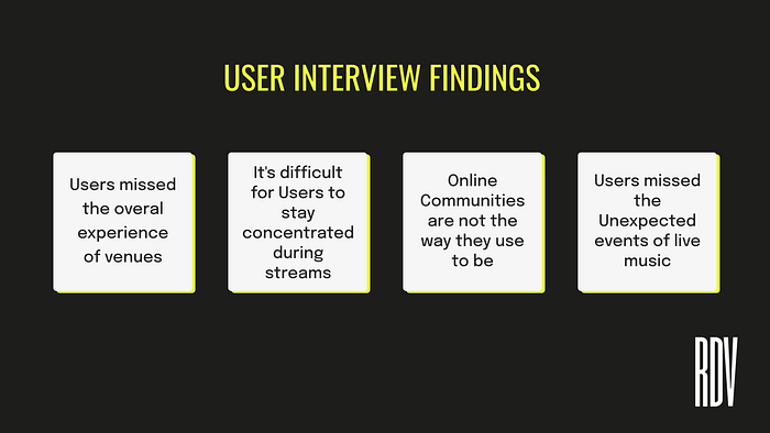
The main finding, however, that went on to change the scope of the whole project, is that people missed people.
When describing their habits around live music, interviewees very seldom mentioned when they were with their friends unless it was before or after the show. However, all of them without exception (or prompt) mentioned how much they loved meeting people at shows. People missed the human experience and unexpected chance meetings that happen in the context of live music.
Define
Affinity Diagram

Following the User Interviews and with the main pain points becoming clearer, I downloaded and organised my findings into 11 categories, which are :
- Unexpected Events
- Meeting People at Shows
- What Experience Music used to be like on Social Media
- Struggles with Concentration while watching Live Streams
- Emotions felt during live shows
- Discoveries, Exigeances
- The importance of Ambiance and Scenography during shows
- Audiences’ relationship to Artists
- Experiencing concerts with Friends
Organising these findings into the Diagram enabled me to continue defining the problem with the creation of Personas and Journeys.
User Personas
Thanks to the variety of users interviewed, I realised that while the idea was to make the application accessible to music aficionados and scene novices alike, if we were to create an active community and build a framework that was built to last, it was important to cater to users who would want to use the application more than just for watching shows.


I decided to create personas because while most users mentioned the same pain points in interviews as previously stated, these strifes weren’t always in the context of achieving the same end goal. This is why I decided to create three specific user personas to cater to different age ranges but also to keep in mind different goals while tackling the one challenge which was meeting new people at virtual shows is near impossible.
User Journey Maps

Though I created a User Journey Map for each Persona, I decided to use Hugo’s as the basis for the rest of the application ideation process. While Aimée’s was interesting in terms of designing an organised and evolving community in Rendez-Vous and Chris’ will be useful for designing an application built to last due to his younger age and different use of the internet, Hugo’s journey and potential use of the app helped me stay concentrated on designing a feature that I could integrate to the Live Streaming functionality. If I had chosen one of the two others, I might have strayed too far from the app's main functionality.
The journey I designed for Hugo also incorporates the fact that he could have gone to a live show if outside factors hadn’t come into play. This was important because one of the main points that the Client mentioned during the kickoff is the Rendez-Vous has no intention to replace live concerts or to be a temporary solution during the pandemic. They want to offer a hybrid solution that would still be used once live music returns to venues.
Problem Statement
Music fans need a way to experience the unexpected interactions that occur in live music venues because it’s the unknown that makes the experience of live music memorable.
Ideation
Secondary Research
Nobody goes there anymore, it’s too crowded — Yogi Berra
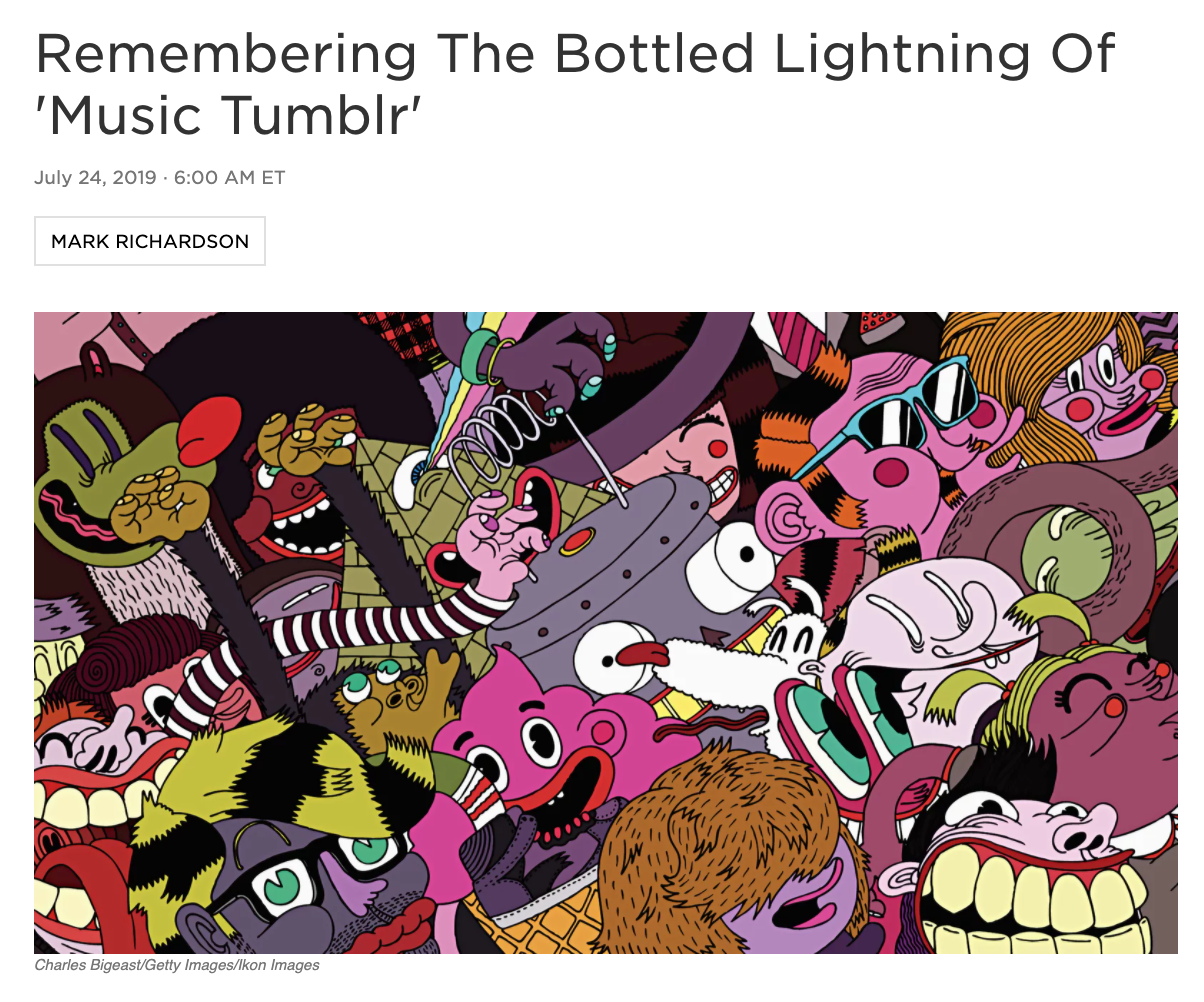
Early 2010s Music Tumblr
Music Tumblr was mentioned multiple times during User Interviews, with one interviewee even mentioning that their experience of being part of Jack White’s fanbase on Tumblr in the early 2010s and the community sharing and creativity aspect during live streams was the closest she had felt to being at a concert on a virtual platform.
With such strong feelings of nostalgia and longing from users, I felt like it was important to dig a bit deeper to truly understand what made up such a dense but also specific community and why it declined.
Thanks to a couple of “Oral History” articles, as well as looking into more casual discussions on social media, I was able to find interesting insights about what made that place and time on the internet so special and why it has since faded.
- Many users considered their relationship to Tumblr as Obsessive but in neither an addictive or destructive way. It was a platform that promoted discussion which energised them and gave them new creative ideas.
- From the outside, Tumblr had all the aspects of usual social media interactions like post writing or sharing (reblogging) and commenting. It was something about the platform's position in pop culture that encouraged people to let their guard down.
This position in Pop Culture made users feel like they could present ideas with a certain amount of abandon and that they were “doing (their) thing off in a corner”. This may have been due to the possible anonymity of the platform or the fact that Tumblr had garnered a reputation for a certain “outsider” demographic which was passionate about certain topics.
- The structure of the platform seemed to reinforce the creation of a specific community. The User Interface of Tumblr made it easy to post and follow discussions.
- Conversations moved to Twitter or Medium in the case of essays

Indieheads
When researching active music communities r/indieheads often came back as one of the most prominent and creatives. With over 700,000 subscribers, with noted music publications citing them as a source, this subreddit somewhat hard to define. It’s a message board where people discuss indie music but it’s also a place where users can discuss their opinions or even vote in polls and organise Q&As with artists. Indieheads has also promoted offshoots from the community including comprehensive lists and even a podcast.
The creative community projects were particularly interesting in terms of insights for my client as, in time, they want Rendez-Vous to be a fertile terrain for users to create content from in-app events and share amongst themselves and with the artist.
How Might We Notes
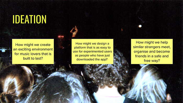
Thanks to the insights from my Primary and Secondary Research, I was able to brainstorm and arrive at many How Might We Notes that I filtered down into three distinct problems to carry over to Ideation Workshops.
Ideation Workshop
As this was the final project of the Ironhack UX/UI Bootcamp, I was able to brainstorm with other designers. This enabled me to take a step back from Rendez-Vous, hear other visions of the project and bounce ideas off other people. We underwent two rounds of Bad Ideas, the point of which being to take one of the previously mentioned How Might We Notes and think of the worst solution possible that we would then transform into a good idea.
How might we create an exciting environment for users that is built to last?
- To design an application Built to Last, it would be important for Rendez-Vous to have regularly renewing content.
- To recreate the experience of a real venue and create a feeling of depth in the live show, Livestreams could have different areas like a real venue that would offer different activities or ways of chatting.
How might we design a platform that is as easy to use for experimented users as people who have just downloaded the app?
- So that the application is accessible to new users, Rendez-Vous shouldn’t limit new user interactions through complex content. Innovation should not be without explanation.
- To promote sociability and meeting in the app, users could have flairs (similar to those of Reddit) so users could easily recognise others that share common taste or habits. This would also enable easy recognition of new users, prompting more experimented users to be welcoming and helpful.
How might we help similar strangers meet, organise and become friends in a safe and free way?
- For moderation, Bouncers could intervene when trying to access larger public rooms to ask questions or to filter users into different areas.
- For community moderation, users could vote on others they interact with if they have good conduct or otherwise. A possibility to report rowdy or shady users would be a must.
- If users want to continue chatting to other concert-goers they met, both of the parties would have had to save each other prior.
Word association
As I was the sole designer on the project, I found myself quite naturally doing word associations in my notebook as I was working. I asked myself two main questions following some of the ideas we imagined during the previous workshop which were:
- What kind of new content can you find during live shows?
- Where do you meet people at concerts or festivals?


Visual Vocab
Finally, in the same approach as Word Association, I decided to create a Visual Vocab which I view as a sort of Word Moodboard, to concentrate on the crux of what I was working on.

This helped me see the features more clearly but also made me realise that I had arrived at a crossroads.
On one hand, I could create a forum where people could discuss news and share content that they had captured or created during live streams, facilitating the creation of a community similar to that of Tumblr or r/indieheads.
On the other hand, I could create a feature that would emulate a live concert venue. It would be smaller in terms of scale but more immersive, helping users meet new people in a personable and natural way.
As I didn’t want to lose sight of the main functionality of interactive streaming, it seemed counter-intuitive to create a new feature that didn’t incorporate live music.
Thus, I chose to go with the latter and start creating a feature that would enable users currently watching the live stream to wander around different areas of a venue, like a real concert, and meet new people.
Challenge: Not make it a dating site.
Prototype
Feature prioritisation
It was important to filter through the different features or elements of the design to arrive at a viable core feature that I could present to my client at the end of the two weeks.

I chose the MoSCoW Method to do this, as it was the most straightforward and clear way for me to do so. Though some of the Should Haves made their way to the MVP, some of the more complex Must-Haves (like anonymous user votings through claps) became a bit simpler in my prototype. My goal for this Feature Prioritisation was to keep the personality of the features I ideated, all while keeping in mind that I needed to prioritise Quality over Quantity.
Userflow
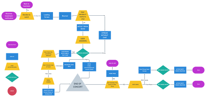
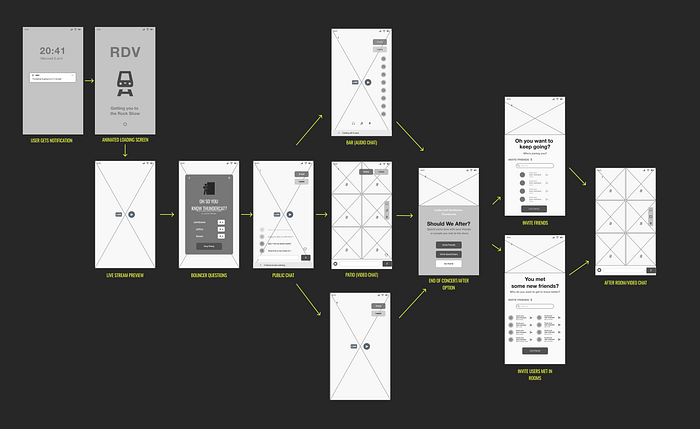
The user will receive a notification that either an event he is participating in or an artist he follows is going live, he is taken to the app through an animated and/or interactive loading screen and is met with a Bouncer Page that asks him how he wants to proceed. The idea of the Bouncer Page was to start creating the atmosphere of a real venue as early as possible. The user then gets to choose different kinds of social Livestream either choosing to proceed to socialise, invite other users to join him or proceed alone. If he decides to proceed to the public chat, he is greeted with another Bouncer who asks him Trivia Questions about the artist. This is a means I found to filter users into different public chats, enabling more active or hardcore fans to interact amongst themselves and more casual users to simply enjoy small talk and the show, creating a sort of community in each chat.
While in the Livestream room, the user then has a choice to jump between Rooms like the Patio (where they can hear the concert but voice and video chat with other users), the Bar (where the user can voice chat with other users all while still viewing the stream) or the Merch Table (where users can watch the show while discussing a specific topic that the artist has chosen).
Finally, when the show ends, Rendez-Vous offers the user the choice to go to an After Party, a sort of video chat room, with either Rendez-Vous users they already know, or invite users that they met during the show that they have saved. In terms of moderation and safety, to invite users met and saved during the stream, the other user has to have done the same.
Lo-Fi Wireframes
Mid-Fi Wireframes
Usability Testing
Usability testing went quite smoothly. After creating mid-fidelity wireframes that integrated the Room functionalities into the current look of the live streaming feature of Rendez-Vous, I tested a sample of users. I asked them to navigate to certain rooms and when they had successfully done that, told them that they had changed their mind and want to go to another area. The Usability Test was mostly to make sure that the copy that I had used for the new functionalities made sense for users, I also wanted to make sure that I wasn’t overwhelming the MVP with features that weren’t completely necessary. Finally, I was also interested in the users’ opinions of the social functionality I had designed. I was able to collect multiple interesting insights, notably:
- Some icons were not clear for users, notably the different icons to change the different audio volumes (other users/concert)
- The copy wasn’t always clear for users. As V-Cult had already imagined that groups of users would be called Rooms, I called The Bar-Patio-Merch “Areas” with the button saying “Go Further” referencing the space of the venue. Users didn’t completely understand that. After discussing it with the client, I renamed the button “Rooms” for now.
- I had a RANDOM functionality for the After Party rooms. Some users who were testing scoffed, one noting “this isn’t Chatroulette”.
- Users also noted that they would have wanted to have a No Chat possibility from the first time they access the show. I removed an Invite Friends button and replaced it with the No Chat button.
Style Tile
For the UI elements, colours and typography, I was lucky enough to have access to the pre-existing Design System that V-Cult was working on. This enabled me to save time and get inspired by the existing look of the application to create new buttons, find similar icons, reuse existing components all while ensuring that my feature would slot in naturally into the environment of the live stream.

Hi-Fi Wireframes

Final Product
Retrospective
Challenges
Since I knew that the client was more in need of thorough UX work and didn’t particularly desire me to take risks in terms of UI, I ended up spending a lot of time on research and ideation to offer a viable feature concept and insight into the application as a whole. This led me to not have the time to truly get creative in terms of the Interface of Rendez-Vous’ Social Feature. This was frustrating when presenting the final project to the company.
What can be improved?
I’m interested in going back to the feature with the User Interface Designer and Art Director to get a bit more creative with certain aspects of it. There is a lot of the proposed UI that I would like to polish or change. I believe it would be interesting and immersive to work and elaborate on the Bouncer Feature, by turning the overlays into pages, as well as adding some animation and interactivity inspired by BerghainTrainer which would help with auto-moderation for drunk or nefarious users. I would also like to go back and polish the prototype as it is.
What’s next?
I think it would be interesting to continue building on the sound design of the different rooms of the virtual venue which would add to the immersiveness. It might also be particularly informative to look into other applications that work in XR. Finally, I would like to keep researching to find a seamless and enjoyable way this feature could slot into the existing MVP.
Thank you for reading!
If you have any feedback, want to collaborate or just want to say hello, let’s get in touch!
